Kevin Kennedy

Founder and Architect at Cluck Design Collaborative PLLC, Charlotte, NC
Education:
Bachelor of Architecture, UNC Charlotte (1997)
Cluck Design Collaborative PLLC was established in 2005. The firm works with architects, contractors, artists, craftsmen, estimators and others outside the traditional architectural model where appropriate. They describe the result as “design that is smart, socially responsible and super cool.”
Cluck is a Charlotte-based architecture firm born out of a mutual respect for solutions and making design accessible. In the last 19 years, cofounders Kevin Kennedy and Chris Scorsone have compiled a unique portfolio of global projects (India and Haiti Projects included) spanning across each architectural project type, as well as furniture and product design. They operate out of Charlotte, NC and New York, NY.
Work Samples
The Goodyear House
Date Completed: 01/28/2020 | Credit: Cluck Design, PLLC

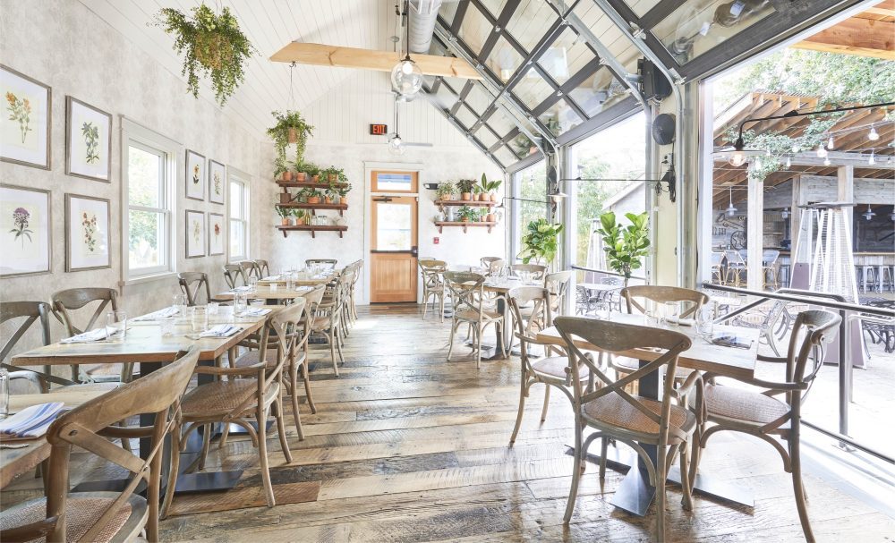
What question or challenge did this project address? At The Goodyear House, we focused on the challenge of the sustainability of the local economy and resources. The philosophy behind the project itself—that a good year for the farm would result in an addition to the house—lends itself to these concerns. Every financial decision must be made with the following seasons in mind. This was not one giant undertaking, requiring demolition and/or ground-up construction; this was a steady, intentional use of time, energy, and resources. There was also great attention paid to the use of local components, where renovations were done to facilitate bringing the materials back to their original form, or adding elements that fit with the local palate. Finally, the pièce de résistance of resource design shines in the form of a large holly tree, around which almost all of the exterior structure decisions were made in order to preserve. It is now beautifully incorporated into the award-winning patio for all to enjoy.
Description: The Goodyear House Restaurant is a tribute to a simple premise rooted in rural mid-western life: if the farm had a good year, you could add onto the house. Built in 1900, the structure started as a mill home. It has gone through a series of renovations over the past 120 years. This latest transformation involves major additions—dining rooms, a courtyard, and a toolshed bar. At the center of this collection of appendages and outbuildings lies the centerpiece—a giant holly tree as old as the original house. Six large garage doors roll up to give the restaurant an open-air feel. The outdoor features exposed brick—a rustic detail. The owners, who also own the two adjacent properties, plan to continue the success of Goodyear House onto the adjacent properties with improvements that will further emphasize the unique character of the business. “It’s going to feel more like you’re in someone’s backyard, rather than in some commercial building.”
Common Market Southend
Date Complete: 10/05/2018 | Credit: Cluck Design Collaborative PLLC

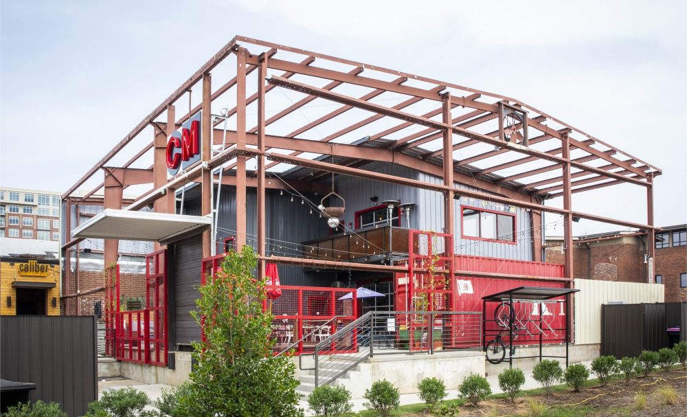
What question or challenge did this project address? Traditionally, the Common Market’s appearance takes on the feel of its neighborhood. The new building had to fit the same pattern. The final design includes about 5000 square feet of interior space with a 2000 square-foot patio area. The mashup of brick warehouse and pre-engineered metal structure reflects the eclectic feel of the neighborhood. The structure feels industrial, but art and curiosities shape the space. To finish off the look, the Common Market team packed up the kitschy décor from the original location and used it to decorate the Tremont location, with a few new pieces to spice it up.
Description: The Common Market has become a Charlotte institution. The owners’ original concept seemed simple — a modern take on the general stores of the past. Always a neighborhood gathering place, the market grew into a deli, then a pub, then a music venue. The South End store (the Common Market’s 2nd location) opened in 2008 and immediately became the neighborhood hub. Unfortunately, the South End location closed in 2016 when the site was sold to make way for an office building. By design or by osmosis, the Common Market again takes on the look and feel of its neighborhood — that’s a big part of the appeal, and it was one of the clients’ requirements for the new building. The structure is about 5000 square feet. The design combines a brick warehouse with a pre-engineered metal structure. The overall feel is industrial, but the addition of local art and other knick-knacks gives it a homey, kitschy atmosphere. To finalize the Common Market look, hand-picked décor from the original location was brought in, and the staff rotates through other artistic touches as the mood grabs them.
VanLandingham Estate
Date Completed: 08/01/2020 | Credit: Cluck Design Collaborative PLLC

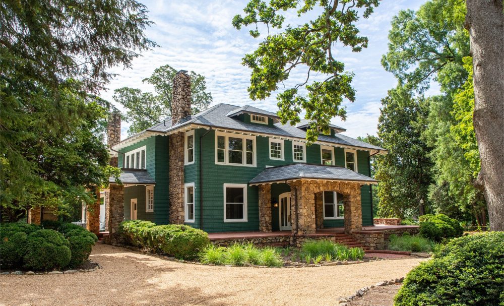
What question or challenge did this project address?: The VanLandingham Estate highlights unique approaches to integration and local ecosystems. There are several components to consider, especially where a delicate balance is struck between the past, present, and future of the VanLandingham Estate and its environment. When we designed for integration, we focused mainly on how to preserve the details that made this estate so timeless, while also planning for generations to come. Many locals have a rich personal connection with the house-turned-event-space, and our efforts centered on bringing these fond memories to the forefront. The neighborhood in which the estate is located, Plaza Midwood, has spent the last few decades wrestling with the idea of integrating people and place, future and past, accessible and elegant. By renovating the main house and including the addition of the Topiary, we brought the estate into the 21st century and created pathways for a more equitable use of space by the community. There is also a high priority placed on preserving local flora and ensuring the conservation of the estate’s award-winning grounds and gardens. The historical gardens are home to the most impressive collections of rhododendrons in the area, and the structures that surround the walls of the Topiary are comprised of screens that house carefully selected local vines and flowers. The VanLandingham Estate has outlived many of its neighbors, and will stand in Charlotte as a place that is both private and public, and whose history deserves to be protected. The ecosystems in place, both those that have been there since the origin of the estate and the new additions of local flora, are themselves integrated into a design, which lends itself to preservation.
Description: A historical Charlotte icon, The VanLandingham Estate has had an impactful presence since it was originally built in 1914. The Estate covers 2.8 acres in Plaza Midwood, including gardens, a Main House, and an Orangerie. A destination for Charlotte weddings and events, the Main House renovation will continue as a venue near and dear to Charlotte locals. Many Charlotteans have a story connecting them or someone they know to the Estate wedding venue and its history. To improve the venue’s experience, a large covered patio is proposed off the Main House, the kitchen is converted to facilitate catering, the finishes both exterior and interior are updated, and the Bride/Groom suites are enhanced. Before this upfit renovation, a rezoning did not pass through the City and the Estate was overgrown, visibly wearing its age. During this new project, the VanLandingham Estate was rezoned seamlessly by a well thought out masterplan. The masterplan includes new parking, an improved planting plan, and a connection from the Main House to a new proposed “Topiary” office building on the Estate. In addition to the Main House enhancements, the new Topiary Building will add to the historic landscaping and improve the existing courtyard. The Topiary Building is a proposed 18,000-square-foot, two-story office building. To blend into the landscape, the building will be covered by a living wall system of supported vines. This facade unifies the Topiary into the Estate gardens and makes the original Main House the focal point on the site. Where once stood many historical homes, the VanLandingham Estate remains as one of the oldest and few remaining testaments to Charlotte history. In the years to come, the Estate will continue to weave its story into the cultural fabric of Charlotte.
Greyfriars Residence
Date Completed: 06//09/2018 | Credit: Cluck Design Collaborative PLLC

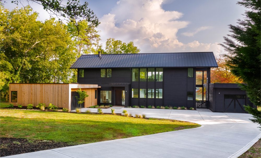
What question or challenge did this project address? Located on Lake Norman, the owner of this lakefront property wanted a house that would add to the beauty of its surroundings. While many homes obstruct views of the lake, this modern lakefront structure was designed to block as little of the view as possible. The first job was to situate the home perfectly to maximize the Lake Norman experience from both the interior and exterior. The next task was to design the house so that the expansive view could be enjoyed from inside the house, from the front yard, and even from the street. This was accomplished by creating a double-height pass-through walkway between the garage and the main structure. Large windows on the front and rear align with open areas inside the home. This allows the viewer to see directly through the structure, thus minimizing the profile and obstruction of the lake views from the front of the house.
Description: Most lakefront homes create a barrier — a large, unnatural obstacle that blocks beautiful views of the lake and natural surroundings. This modern lakefront structure was designed to become part of the landscape so visitors could enjoy the lake from anywhere on the property. The first job was to situate the home perfectly to maximize the Lake Norman experience from both the interior and exterior. The next task was to design the house so that the expansive view could be enjoyed from inside the house, from the front yard, and even from the street. This was accomplished by creating a double-height pass-through walkway between the garage and the main structure. Large windows on the front and rear align with open areas inside the home. This allows the viewer to see directly through the structure, thus minimizing the profile and obstruction of the lake views from the front of the house.