Toby Witte

Architect at witteha.us, Charlotte, NC
Education:
Bachelor of Art in Architecture, UNC Charlotte (2003)
Bachelor of Architecture, UNC Charlotte (2004)
“My education at the School of Architecture at UNC Charlotte has been one of the most essential parts in my development of appreciating architecture as art and sharpening the skills necessary for its creation,” says Toby. One of the most striking hands-on tools I walked away with is the ability to evaluate a design issue, crystallize a tangible project from it, and have the means to explore answers and ideas around it. I was allowed to build trust in my hand and the pencil it holds.
Through the guided exploration of the design process itself, by way of numerous projects, starting with the most abstract and ending with the very practical, I was allowed to understand the richness architecture offers and how to shape it. The quality of our built environment influences how we think of ourselves. Architecture tugs at our emotions, our senses, our thoughts. The creative act of architecture is a powerful deep dive into the human experience. As architects, we literally shape our world. The SoA gave me the means to not only approach and try to understand the power architecture holds, but also the skills and confidence necessary to explore and create it. All aspects of the education at the SoA worked in tandem to build out my appreciation for and ability to work within architecture. From exploring its history and precedents and the arts as a wider field, to skills on paper, on workbenches, and on computers, to building science, understanding of structure, and insights into the profession – all parts of my SoA education shaped and influenced my own experience and expertise that I continue to grow. I will be forever grateful for the deep insights my SoA instructors shared and their tireless efforts to find ways to impart their knowledge and skills to us.”
Work Samples
Woung House
Date Completed: 6/1/2015 | Credit: Dialect Design

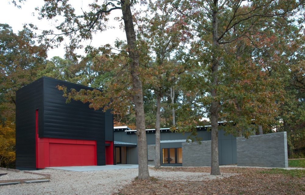
A wall she walked by in her childhood in Jamaica was the memory she brought to us. The need to make it handicap accessible and to provide a live-in suite over the garage was added. As well as the wish to keep as many trees as possible. So we surveyed the woods, cut up the functions of the house, weaved a wall through the trees and reassembled the house all around it. And then we traced the movements through the house and provided views at every turn. Inviting the exterior back in. We took a long look at the topography, exposed concrete floors on solid ground, and wood floors over shallow crawl spaces and engineered zero-edge transitions, provided for three foot wide doors and five foot turning radii to make the home a playground for a wheelchair. The house offers four bedrooms and three and a half baths. For the entry we wedged a vestibule in between two taller independent volumes of the home. One side is the garage and guest suite, the other the house proper. The vestibule is further defined by the roof plane that flares up from the front entry porch and door. There aren’t any actual walls, just the exterior siding materials of the two buildings on either side. The front and back is all glass. The occupants enter this conditioned space, while seemingly being still outside. From there the vestibule opens up to the adjacent spaces by way of a few folds in the two structures. The gently curved eight feet tall free-standing masonry wall picks up the exterior movement of the approach and finds itself in separate entities in other parts of the house.
Witte Home
Date Completed: 2/28/2017 | Credit: witteha.us

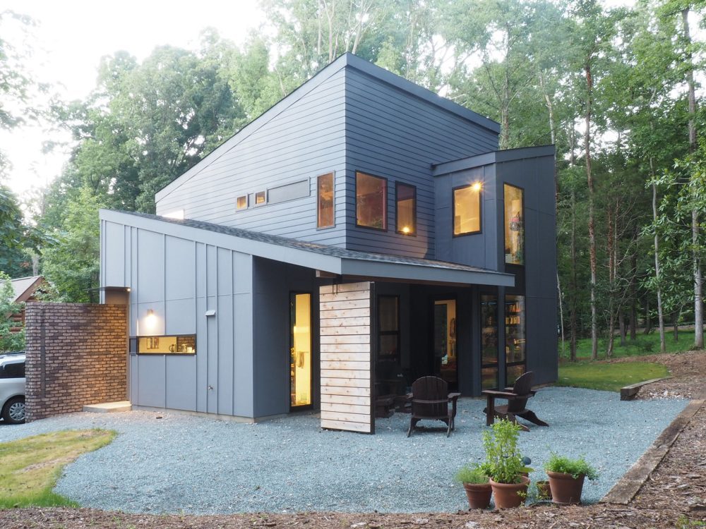
This was a tricky one. How to squeeze 5 family members into 1,710 sf and make it feel spacious? How to make it feel open and luxuries on a shoestring budget? And how to harness Toby’s design fervor and focus his attention on these goals. For this was a house for his family. The stakes were high. As for understanding our clients, he had a leg up. He structured the home around three ideas. Give the daughters each a spacious room on the top floor and let them stick out from each other with connecting windows, so that the sisters always have a sense of each other. Create a loft environment downstairs where the parents’ private spaces overlap with the public family spaces through sliding panels and a signature wall. Eliminate all squarefoot-robbing walk-in closets and instead provide a slew of built-in wardrobes, niches, and shelving. Laid out as a studio apartment the downstairs functions overlap spatially while being provided distinct areas of use. The master bedroom opens to the living room with large room-high frosted glass sliding panels, allowing its floor area to be added to the living room during the day and sequestered for the privacy of sleep at night. The house is organized through three simple overlapping volumes. They are structured around a brick wall that leads from the exterior into and through the home, initiating a pinwheel effect of all spaces. On the first floor living, sleeping, and bathing wrap around the wall with an increasing sense of privacy.
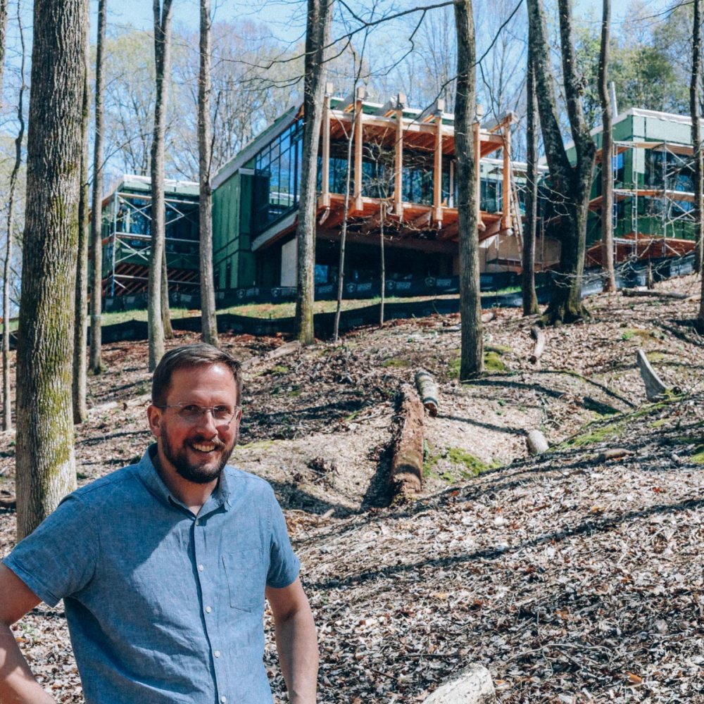
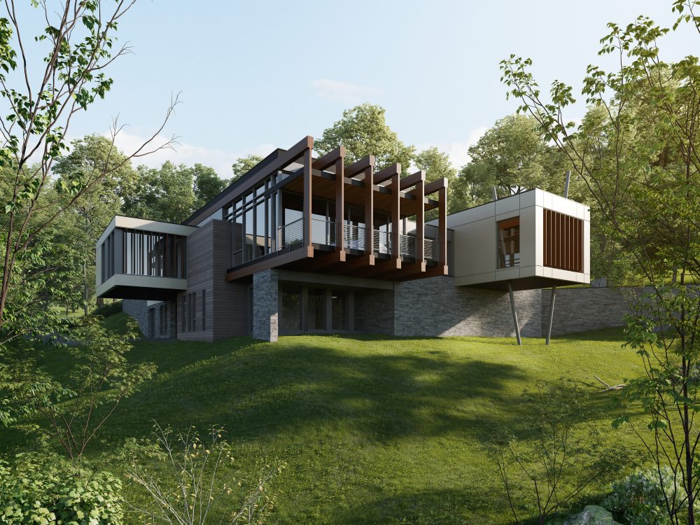
How to provide soaring cantilevers with a handicap-accessible access?
Date Completed: 11/30/2021 | Credit: witteha.us

